The Story of the Easter Church
- Christopher Rutty

- Mar 30, 2024
- 3 min read
As we are in the Easter season, I thought it would be of interest to feature the story of how St. John's became known as the "Easter Church." What does the story behind its unique interior colours reveal about St. John's when the colours were originally discussed and debated in 2001-02, and how do the Easter colours resonate today for St. John's congregation, the local community, and for the larger diocese?
You'll find previous articles about the St. John's colours here,
Here, I would like to spotlight an important article that appeared in the June 2002 issue of The Anglican, titled, "A Splash of Colour: Parish Stirs to Life."
The article began with: "'We are not a beige congregation.' With these words, the congregation of St. John's, West Toronto last year began defining itself through a palette of colours that has resulted in a glorious rebirth of the church's interior. Painted in purplish-blue, yellow and green, the church resembles a planter of hyacinths and daffodils surrounded by bright new foliage, says the Rev. Gary Van der Meer, incumbent. Like the springtime that the colours invoke, the congregation has emerged from a long, wintry period of uncertainty."

As the article recounts, expert colourist and stained-glass artist, Stuart Reid, was brought in to help the congregation discern what a new colour scheme would reflect about what the congregation felt about the church as a building and worship space, what it said about the congregation and what it believed, and what St. John's meant to the surrounding community.
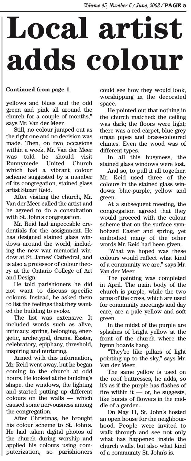
"He told parishioners he did not want to discuss specific colours. Instead he asked them to list the feelings that they wanted the building to evoke. The list was extensive. It included words such as alive, intimacy, spring, belonging, energetic, archetypal, drama, Easter, celebratory, epiphany, threshold, inspiring and nurturing."

Amidst what seemed to be the considerable busyness of mismatched colours in a dark ceiling, beige walls, light floors, red carpet, different colours of wood, blue-grey organ pipes and brass chimes, Mr. Reid noticed how the stained glass windows were lost. He then realized that, indeed, it was the colours in the windows that could pull it all together, especially the blue-purple, yellow and green.
"At a subsequent meeting, the congregation agreed with the colour scheme that on the surface symbolized Easter and spring, yet embodied many of the other words Mr. Reid had been given."
Twenty-two years later, as St. John's has endured an especially difficult period of uncertainty, especially during and since the COVID-19 pandemic, it seems to me, at least, that the spirit of renewal embodied in the Easter colours still resonates. The Easter colours, coupled with its flexible space, still reflect what St. John's represents as a congregation and what it means to the local community, and also what it can represent and mean to the diocese as it searches for new ideas to more effectively engage with surrounding diverse communities, much of which is un-churched, church-ambivalent, or anti-church.
The Easter colours and the words that originally informed them -- alive, intimacy, spring, belonging, energetic, archetypal, drama, Easter, celebratory, epiphany, threshold, inspiring and nurturing -- when brought beyond the church's walls in creative ways and accessible, inclusive language, can serve as an avenue to draw members of that diverse surrounding community into a distinctive spiritual space, where they will meet a welcoming congregation of people dedicated, not unlike Jesus, to supporting each other and to making a difference in the community and in the world.


Comments